What is a website banner?
A website banner is a prominent graphic element on a web page used for advertising, announcements, or brand messaging. The term covers three distinct types: banner ads (paid or programmatic display placements), hero banners (the main visual at the top of a page), and notification banners (site-wide announcement strips). Each serves different goals and has different optimization rules.
Types of website banners
- Banner ads: Rectangular graphic ads placed on third-party sites or your own pages, usually in standard IAB sizes (leaderboard 728×90, medium rectangle 300×250, skyscraper 120×600, mobile banner 320×50). Designed to drive clicks to a destination.
- Hero banners: The full-width visual at the top of a homepage or landing page. Purpose: communicate the core value proposition in under 3 seconds.
- Notification or announcement banners: A thin strip across the top or bottom of every page. Used for promotions ("Free shipping on orders over $50"), compliance (GDPR, cookies), or urgent updates.
- Exit-intent banners: Trigger when the user is about to leave, offering a discount or content to retain them.
Standard banner ad sizes
The IAB (Interactive Advertising Bureau) defines standard display sizes. The five most-used:
- Leaderboard: 728×90 — above-the-fold, top of page
- Medium Rectangle: 300×250 — inline with content
- Skyscraper: 120×600 or 160×600 — side rail
- Mobile Leaderboard: 320×50 — mobile top
- Large Rectangle: 336×280 — higher-performing IAB-standard
Banner best practices
- One primary message. The strongest banners say one thing clearly, not three things ambiguously.
- Contrast over cleverness. High-contrast CTAs outperform ornate designs. Test color, not just wording.
- CTA verb first. "Get the free guide" beats "Free guide available here."
- Mobile-first sizing. 60%+ of web traffic is mobile. If the banner doesn't work on a 375-wide screen, it doesn't work.
- Dismissible. Site-wide notification banners should have an X to close — forced permanence erodes trust.
Banner blindness and how to beat it
Jakob Nielsen's original research (updated 2024) shows users systematically ignore anything that looks like an ad — a phenomenon called banner blindness. Users' eyes skip past standard IAB sizes placed in standard positions. Ways to counteract:
- Match the banner's design to the native page style (native advertising)
- Use non-standard placements (inline, in-feed)
- Trigger on intent rather than on page load (exit-intent, scroll-depth)
- Keep text short — users scan, they don't read
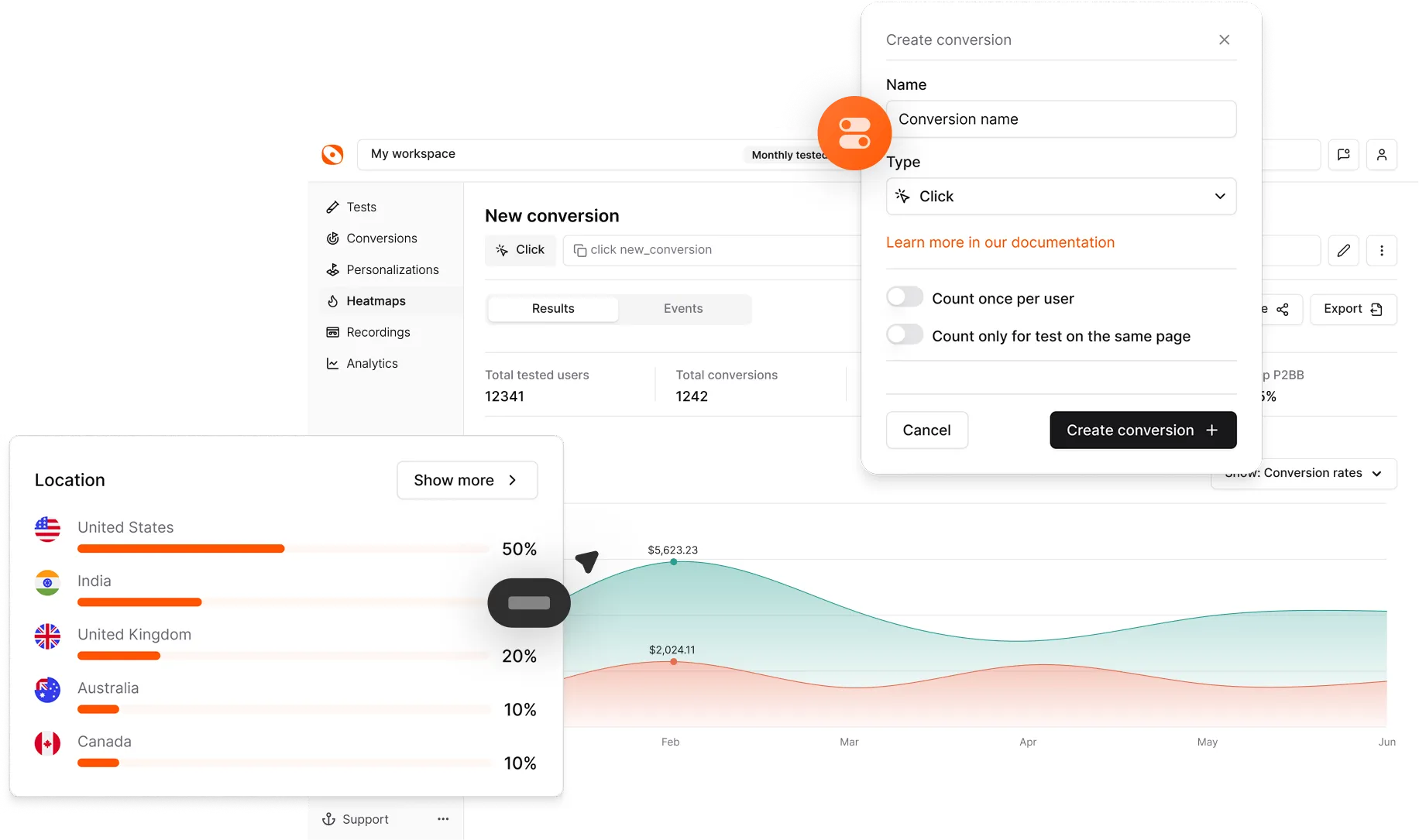
A/B testing website banners
Banners are one of the highest-leverage A/B test targets. High-value tests:
- Headline copy: Benefit-focused vs feature-focused
- CTA text: "Get started" vs "Start free trial"
- Image: Product shot vs lifestyle vs abstract
- Position: Top banner vs hero-only vs both
- Countdown timers: Urgency framing vs evergreen
Common mistakes
- Banner carousels. Multiple rotating slides perform worse than a single static banner — users click the first slide 90% of the time.
- Auto-play video with sound. Breaks trust instantly on 100% of visits.
- Generic stock imagery. Users detect and ignore it. Invest in real photography or custom illustration.
- No CTA. A banner without an action button is decoration, not marketing.
Related concepts
Hero image, landing page, headline testing, exit-intent popup, CTA optimization.